1. S&P 500 seasonality (since 1928)
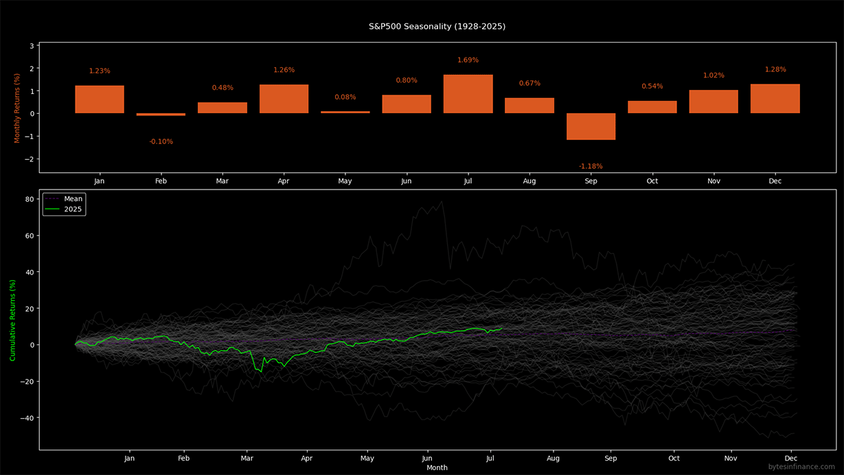
The chart below (generated in Python) shows: (i) historical average monthly returns and (ii) all normalized yearly paths with the current year highlighted. The dataset spans nearly a century to reduce sample bias.

On average, summer months skew positive while September remains weak. Remember: seasonality is a mean bias, not a rule dispersion year-to-year is wide, so combine it with volatility, macro regime, and positioning data.
2. Nasdaq Composite seasonality (since 1971)
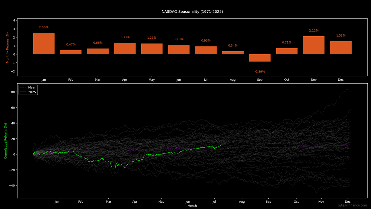
For the Nasdaq Composite, the analysis starts in 1971 (launch year). It shows monthly averages and distribution of yearly paths. Pay attention the graph shows the Nasdaq Composite, not the Nasdaq 100 which is a different index. The Nasdaq 100 (NDX) is a subset of the Nasdaq Composite, focusing on the 100 largest non-financial companies. The Nasdaq Composite includes all stocks listed on the Nasdaq exchange, more than 3000 companies, providing a broader view of the market.

Credit: bytesinfinance.com.
Because of the high correlation with the S&P 500, the Nasdaq Composite tends to follow similar seasonal patterns. However, it shows more pronounced momentum in high-liquidity cycles, with wider dispersion during drawdowns or rate-hike periods. The current year (2025) is highlighted in the chart, showing how it compares to historical averages. Still we can see a weakness in September, similar to the S&P 500.
3. Methodology
- Data: daily closes; monthly series built with month-end close.
- Monthly return: month-over-month % change; averaged by calendar month across history.
- Yearly paths: normalized to 0% at year start; cumulative % returns over the year.
- Visuals: dark palette, % labels over bars, current year highlighted.
Charts are descriptive only and not investment advice. Treat them as a statistical prior to blend with volatility, breadth, and positioning signals.
4. Reproducibility & code
Charts were generated with a custom Python script (pandas + numpy + matplotlib).
Stay in the loop
Quant insights, scripts, and indicators - at most 1-2 emails per month.
